 Hey WDD Readers, it’s June! Depending on where you live, you could either be heading out for a day of Summer fun, or curling up in your home at the bottom of Chile with a hot drink. And if you’re in Chile keeping warm, can I join you?
This month, we got lucky enough to have lots and lots of pretty colorful designs in the mix, as well as a bit of classic minimalism and monochromatic goodness. Enjoy.
Note: I’m judging these sites by how good they look to me. If they’re creative and original, or classic but really well-done, it’s all good to me. Sometimes, UX and accessibility suffer. For example, many of these sites depend on JavaScript to display their content at all; this is a Bad Idea , kids. If you find an idea you like and want to adapt to your own site, remember to implement it responsibly.
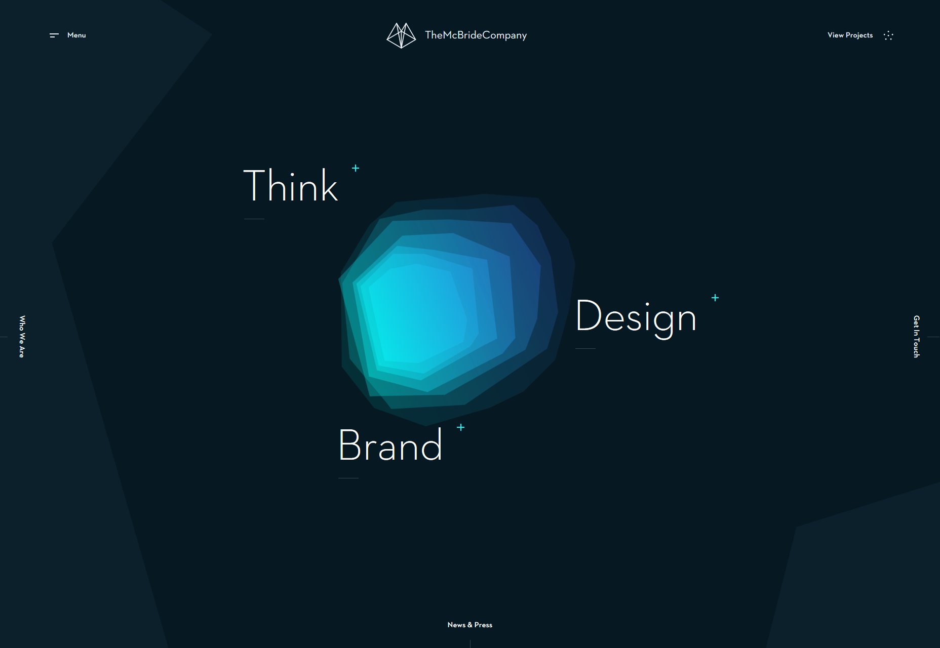
The McBride Company
The McBride Company has a simple portfolio that makes excellent use of a vector-based background to maintain a consistent visual identity all across the site. While there are parts of the design that might benefit from more contrast and larger body text, the overall effect is striking and beautiful.
Platform: Craft CMS
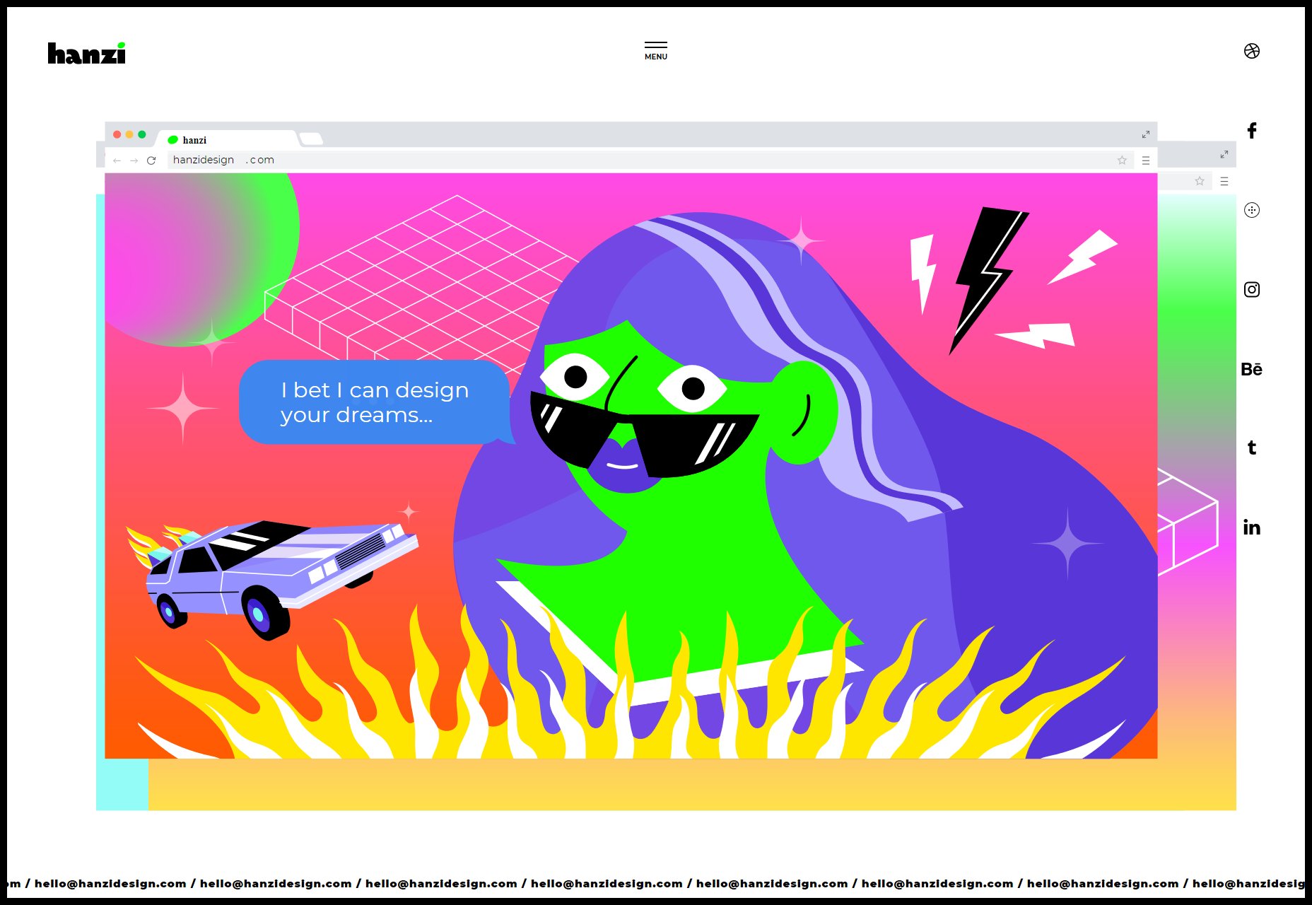
Paulina Hanzel
Paulina Hanzel’s portfolio is minimalist, visually striking, and does little more than it needs to to get the job done (something I can always respect). While the neon-on-white color scheme can occasionally blast the eyeballs, it’s a memorable design.
Plus the “hamburger menu” icon actually includes text that says, “menu”, and I can absolutely get behind that kind of microcopy.
Platform: Static Site
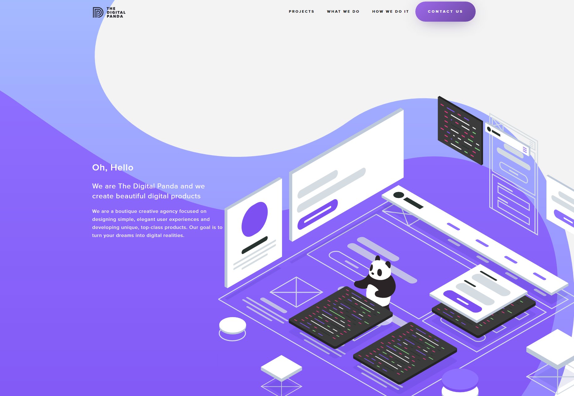
The Digital Panda
The Digital Panda combines two things I absolutely love: pandas (and who doesn’t love them?), and those sort of blob-like design elements that I’m still a bit obsessed with. And let’s be honest, I’m most likely going to be obsessed with them until I next redesign my own portfolio.
Now the main navigation doesn’t always get all the contrast it needs as you scroll down the page, but on the other hand, those are some of the smoothest drop shadows I’ve seen in a while.
Platform: Static Site
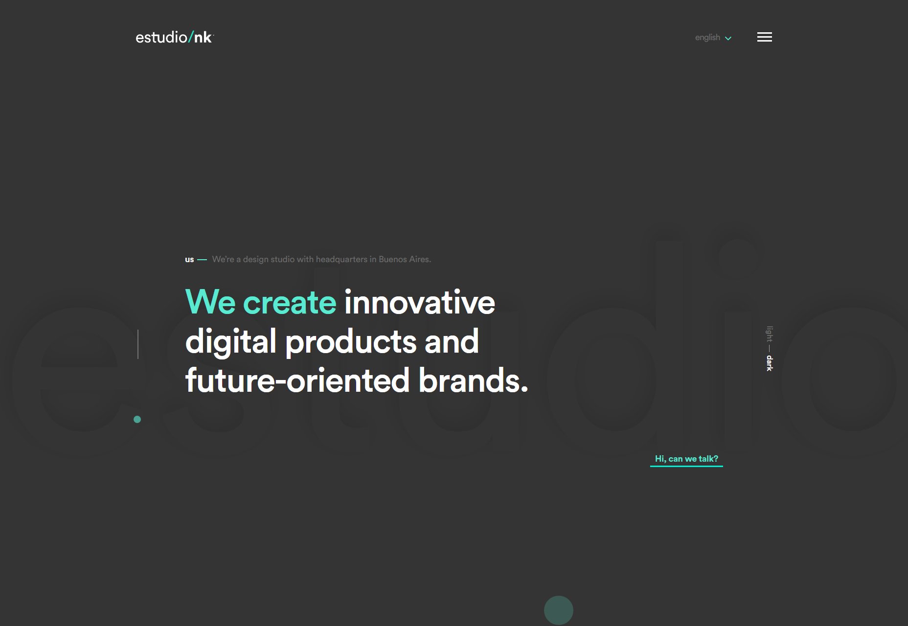
estudio nk
estudio/nk’s agency portfolio has a simple, clean design that is fairly standard, though the choice to display blog posts as a slidable carousel on the home page is… interesting. Where it really stands out is in their use of smooth, quality animations. Overall, it’s just a pleasure to browse.
Platform: Custom CMS (I think)
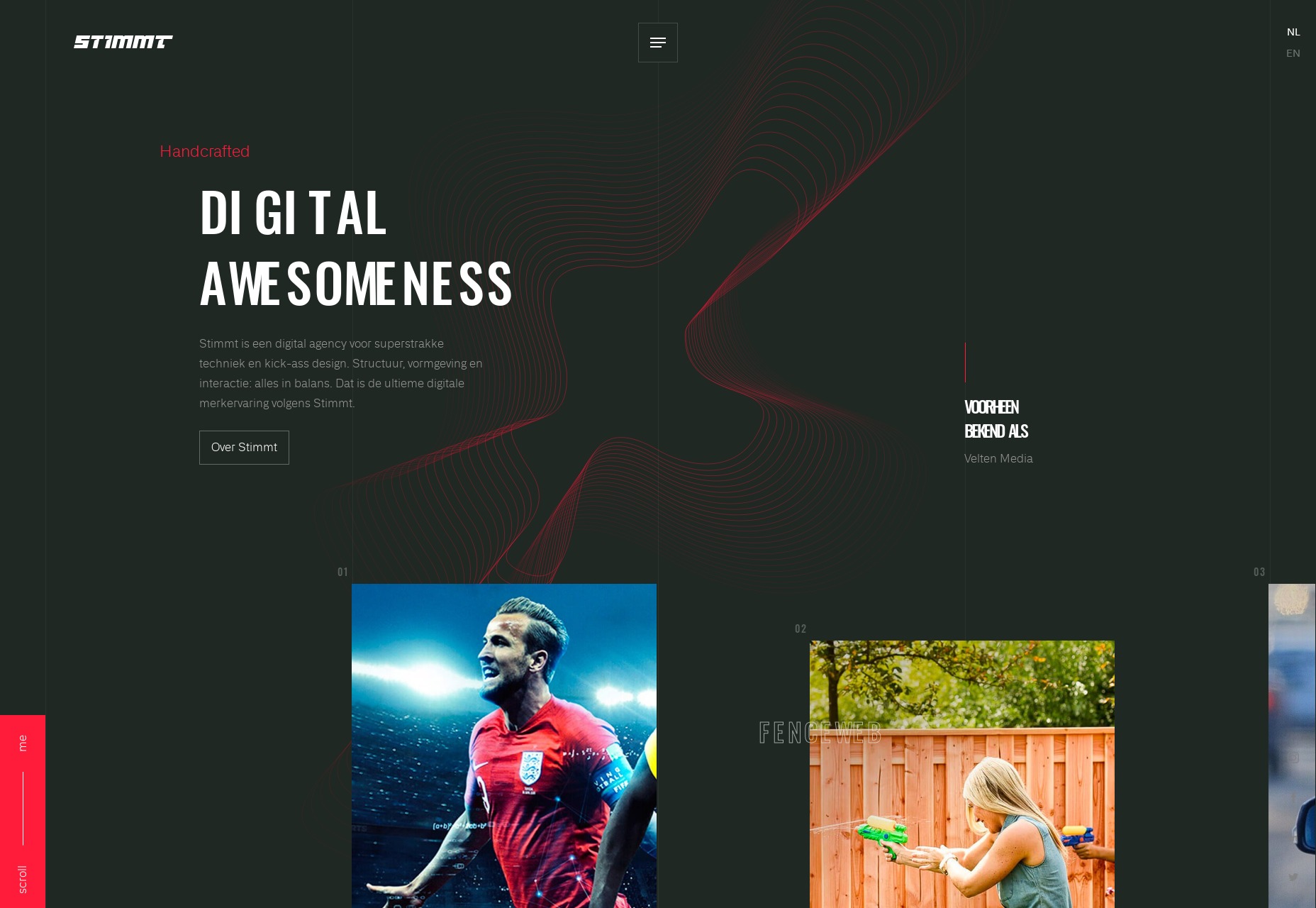
Stimmt
Stimmt mixes the ever-classic put-the-grid-in-the-background design aesthetic with a lot more color than you usually get from that kind of design, dressed up with some admittedly great animation. Plus I like their use of illustration.
Platform: Static Site
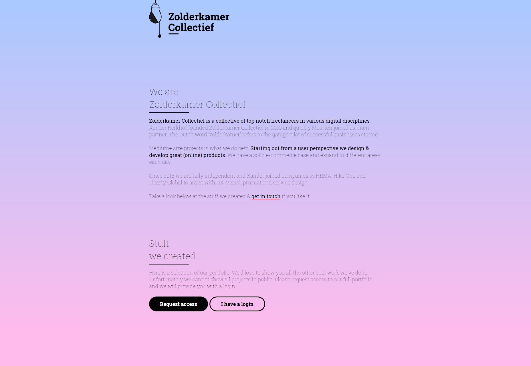
Zolderkamer Collectief
The Zolderkamer Collectief spices up a rather simplistic, mostly-one-column portfolio with only a background gradient, and some good-looking type. The fact that you can only see the rest of their portfolio upon request (because they’re not allowed to show you otherwise) might seem annoying to some, but creates a sense of mystery for me.
Platform: Static Site
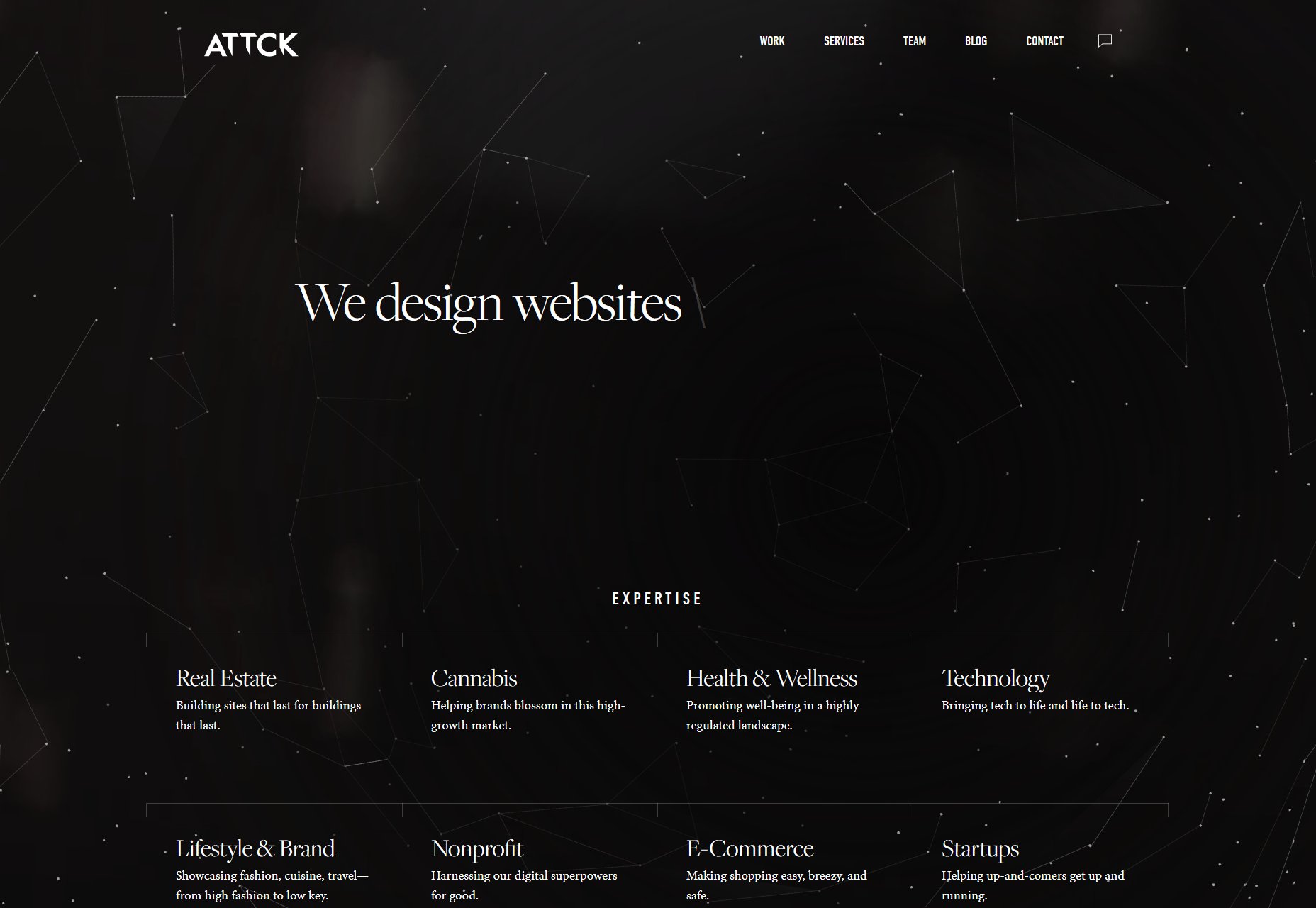
ATTCK
ATTCK makes a bold impression with some lovely constellation-based imagery, and some rather cheeky boasting, including: “We let the dogs out”, “We know the way to Sesame Street”, and even “We are the crypto to your blockchain”. (I dare you to use that line to try and pick someone up in a bar, bonus points if you live nowhere near Silicon Valley.)
They back up their boasting with some great typography, and a visually pleasing layout.
Platform: WordPress
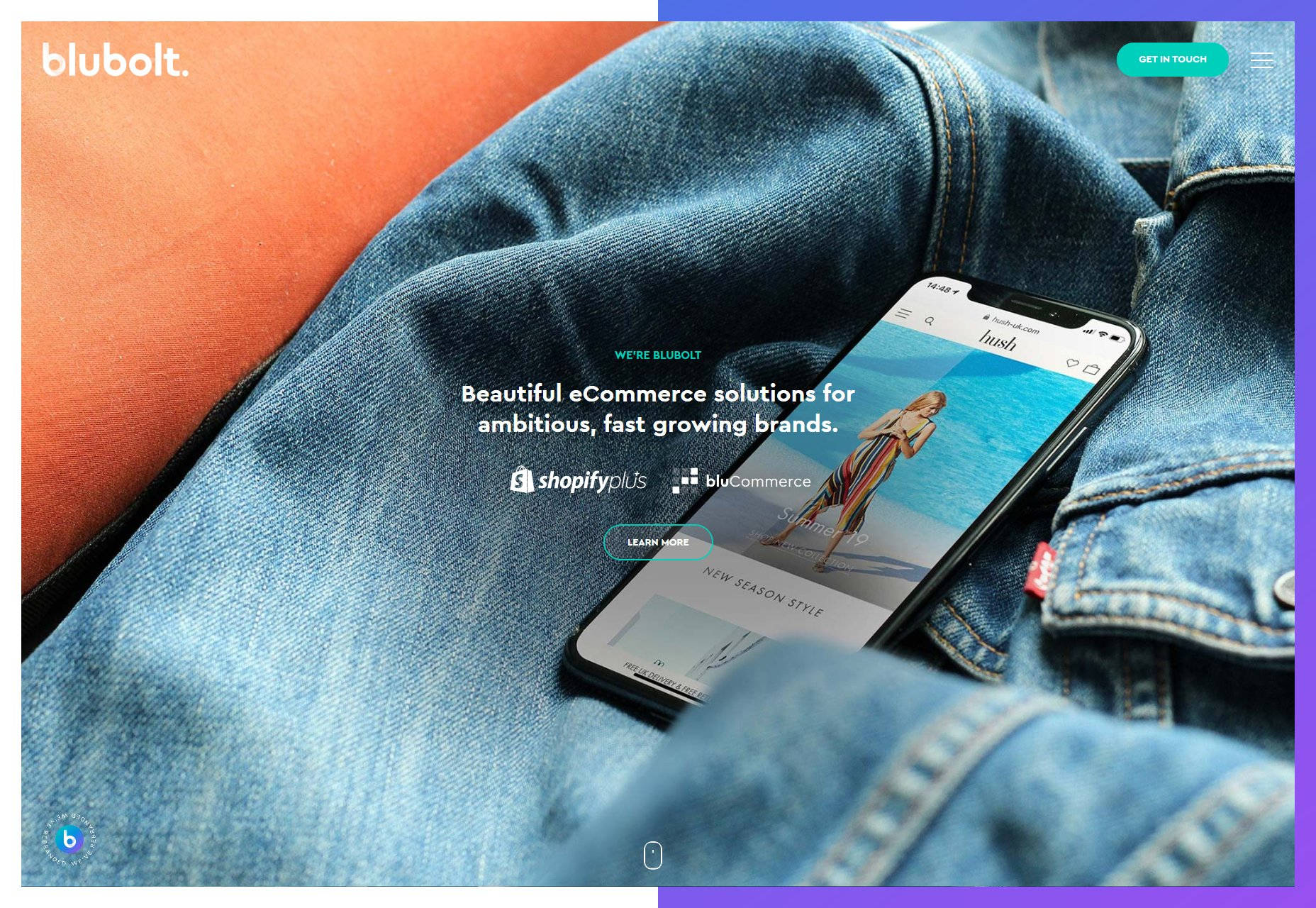
Blubolt
Blubolt is here because it looks good. It’s not going to blow your mind or blast your eyeballs, but it’s well made, and pretty. Enjoy.
Platform: WordPress
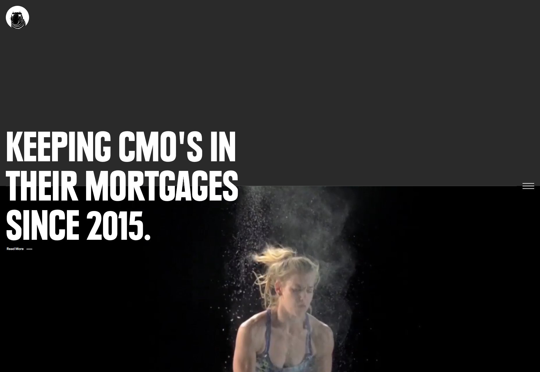
Diko
Diko’s agency website is a highly PowerPoint-ish site that depends a lot on its animation and video, and it works. It won’t blow your mind, but I have no real complaints beyond the usual “It’s too JS-dependent” thing.
Platform: Contentful
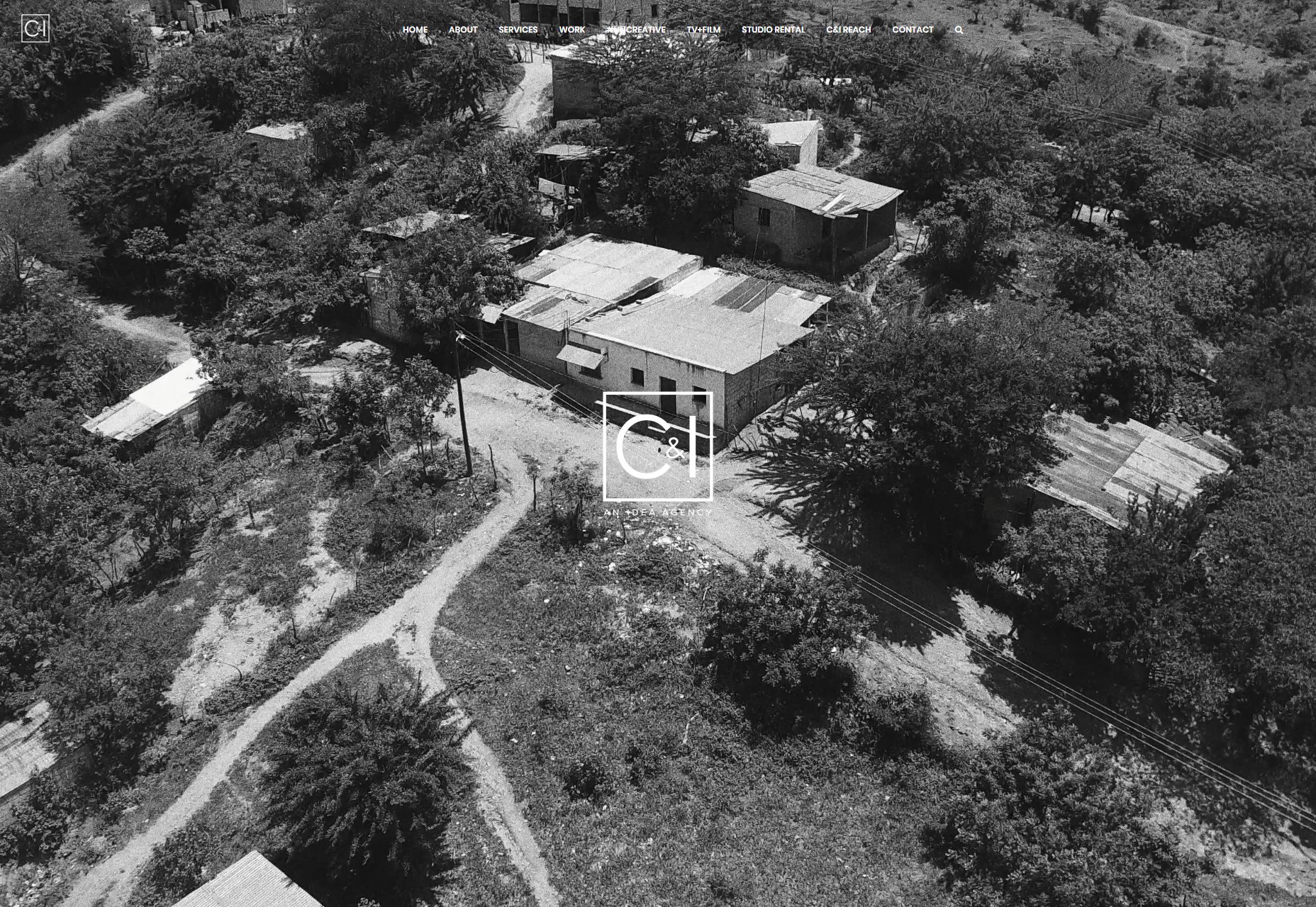
C&I
C&I embraces that sort of prefessional-elegant aesthetic that video and photo agencies are known for, though they do a lot more than that. Still, they mostly depend on the imagery to carry them through, and it works for them.
Platform: WordPress
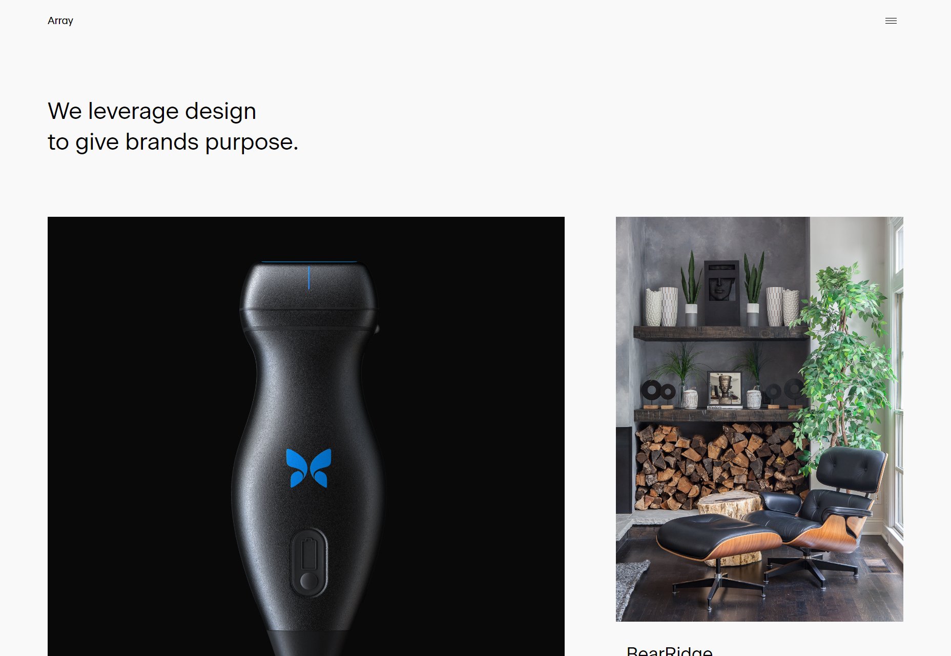
Array
Array’s portfolio is a pleasantly minimalist affair with a bit of asymmetry thrown in. It’s a small note, but these designers know the value of keeping a single-column layout from getting too wide to easily read the text. It’s a lesson some designers seem, to have forgotten these days.
Platform: Custom CMS (I think)
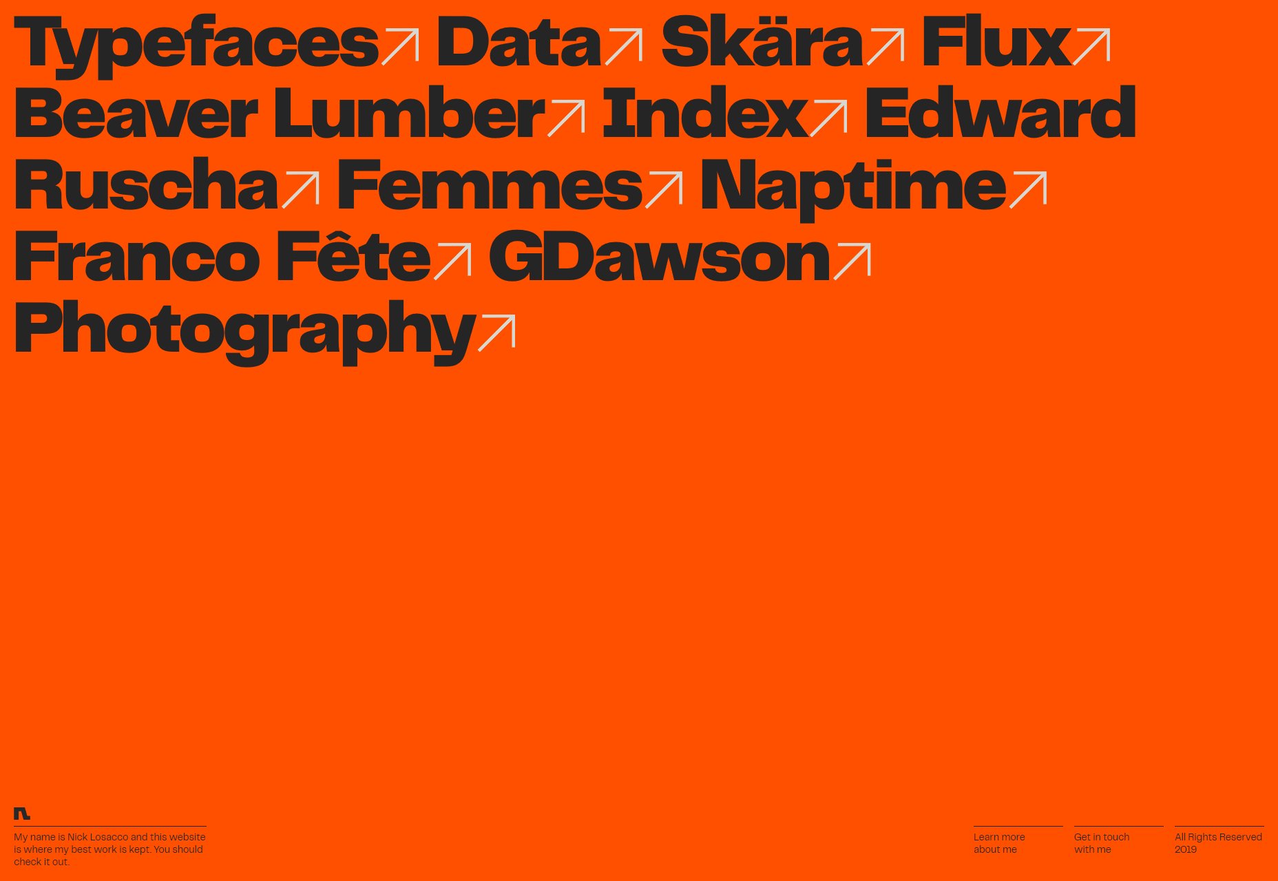
Nick Losacco
Nick Losacco does a lot of different things, but his typeface design is listed first for a reason. In keeping with the theme, his portfolio relies heavily on its typography for navigation and visual spice.
Platform: Custom CMS (I think)
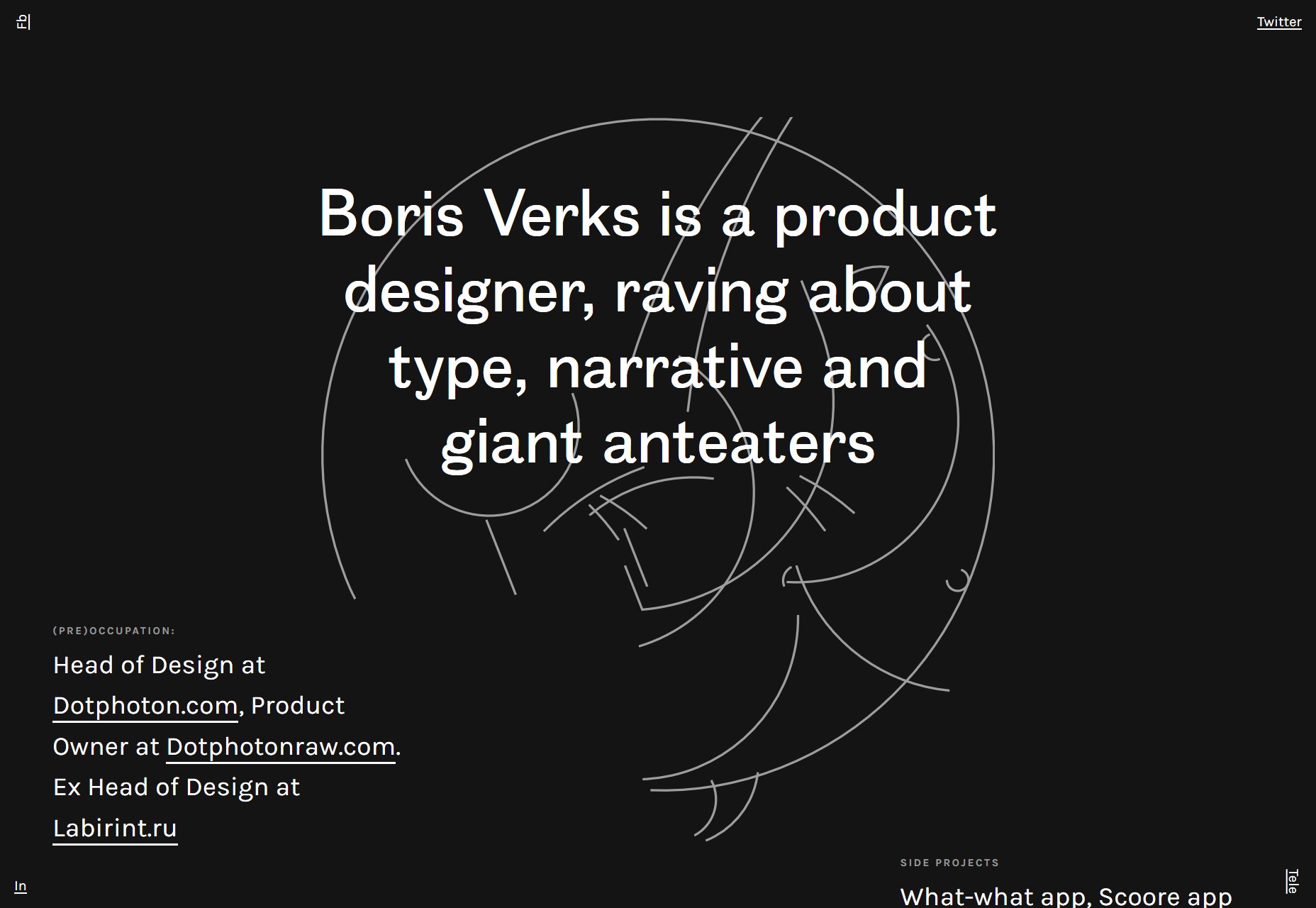
Boris Verks
Boris Verks’ one-page portfolio is a lovely example of type-based design with a little asymmetry thrown in for good measure. And I absolutely love the anteater that is deconstructed/reconstructed as you scroll down the page… I just do.
Platform: Static Site
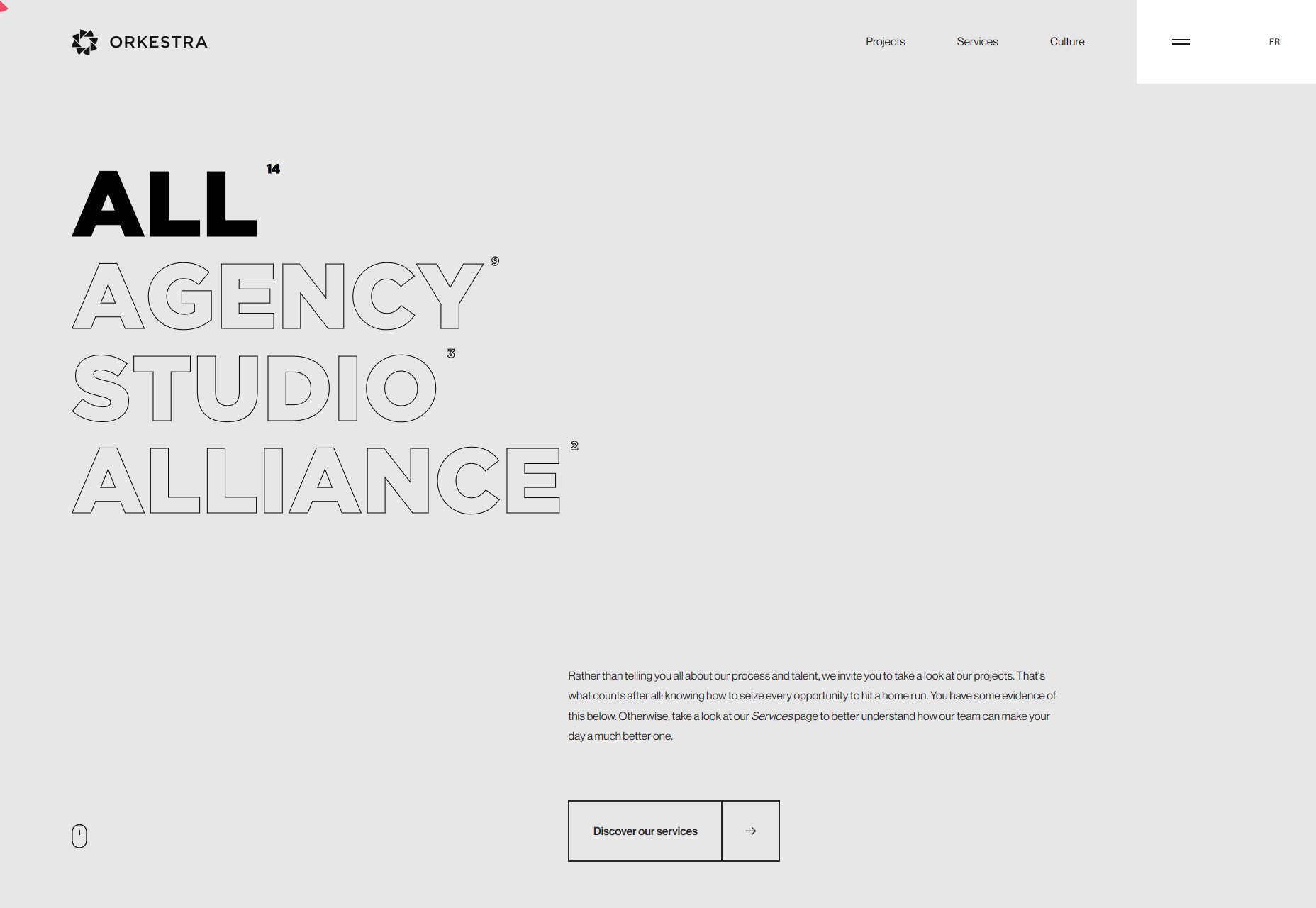
Orkestra
Orkestra brings us another beautiful and nearly monochromatic design that’s heavy on the animation and outlined type. I have to say, I never get tired of seeing flawlessly executed grid-based layouts.
Platform: Static Site
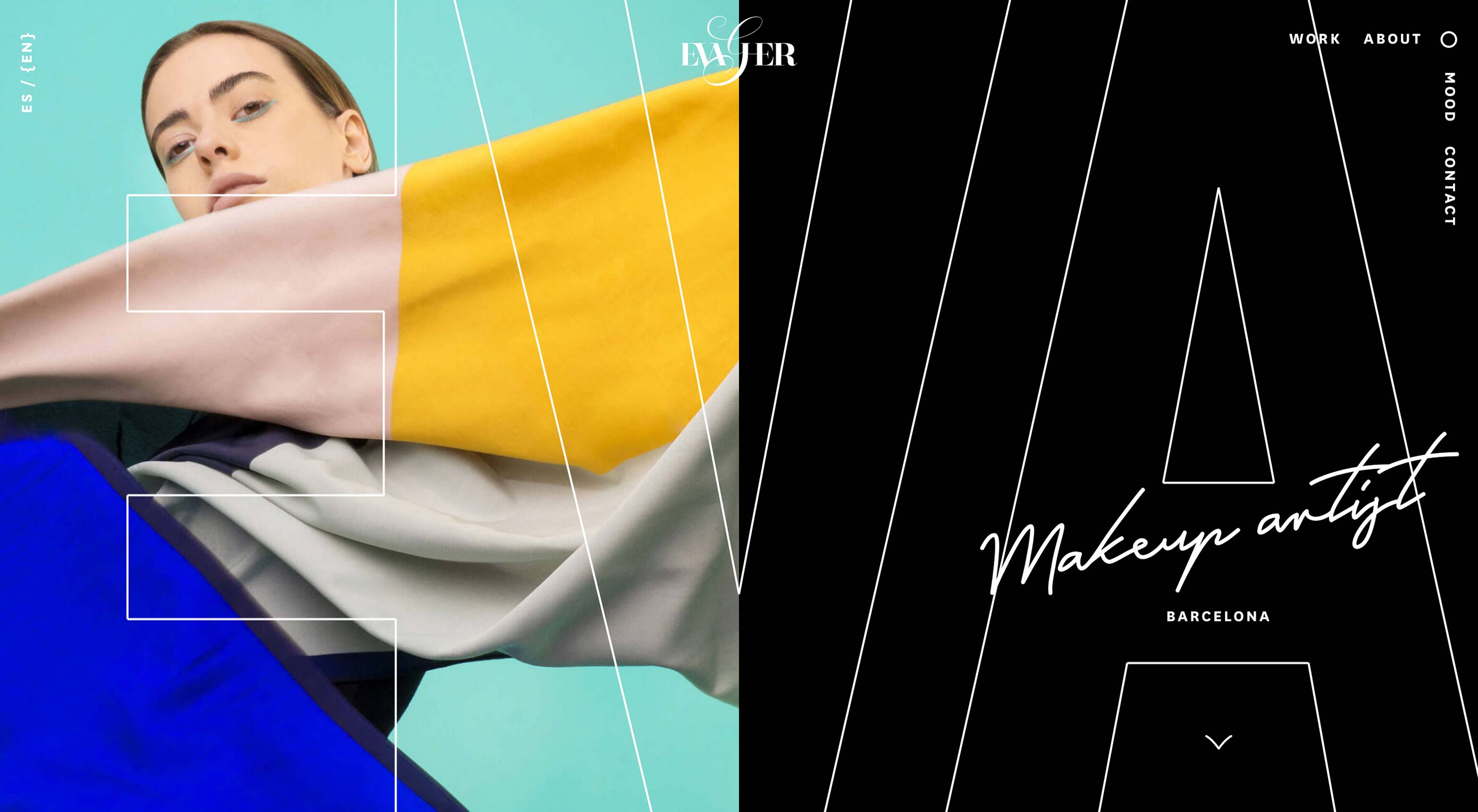
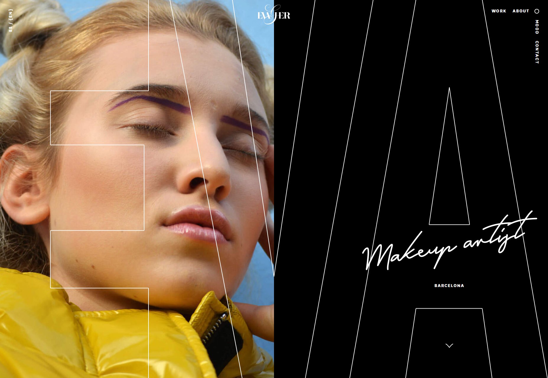
Eva Garcia
Eva Garcia’s makeup artist portfolio is a classic example of its style: elegant, sophisticated, and artsy as all heck, while still being fairly intuitive and usable.
Platform: Statc Site
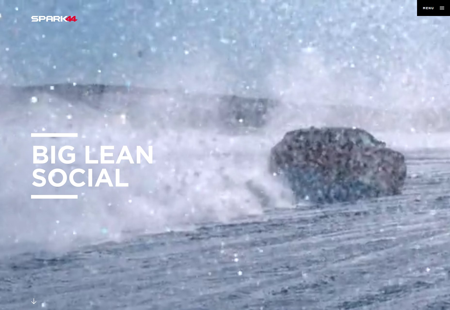
Spark44
Spark44 leans into its self-described theme of “big and lean”. Everything on the site including the type is big, and none of it is contrived or overly fancy. There’s just enough solid red and imagery the offset the mostly-monochromatic theme. It’s not minimalism for its own sake: it’s minimalism with powerful intention behind it.
Platform: Static Site
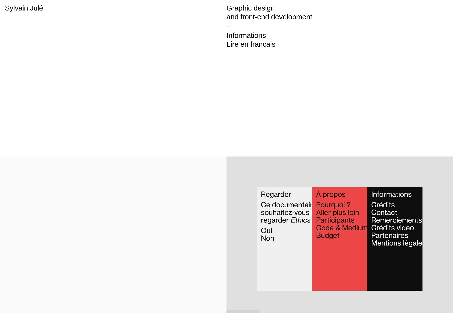
Sylvain Julé
Sylvain Julé’s portfolio is as minimalist as they get, and I have to admit that I quite like the way they pulled off the two-column layout. I also appreciate the way they use video to show off their portfolio pieces… even if it does load a bit slowly on my current Internet.
Platform: Static Site
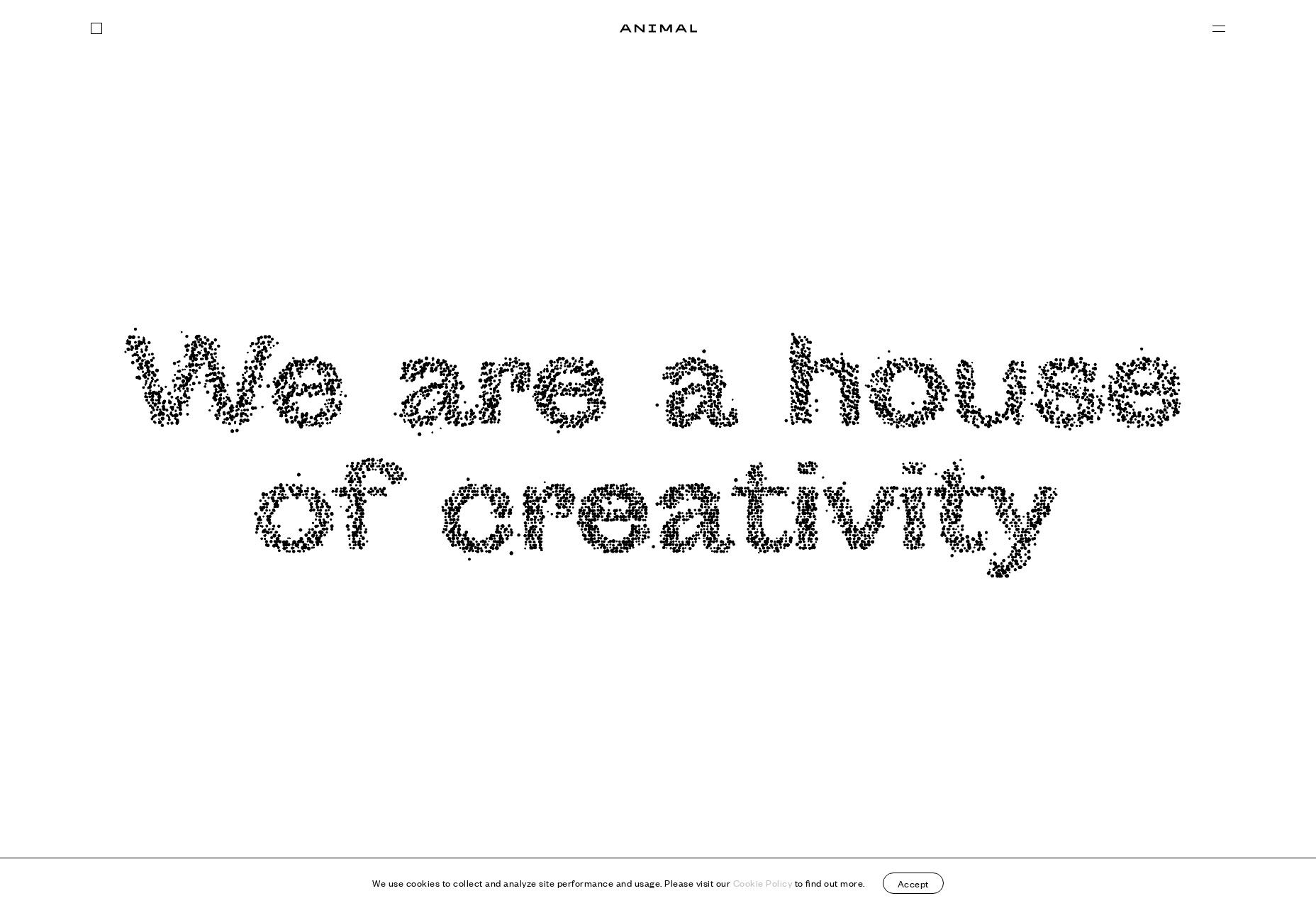
Animal
Animal takes us back (yes, back) to that sort of post-minimalism with some asymmetry, a whole lot of white space, and a case study-focused approach to showing off their work.
Platform: WordPress
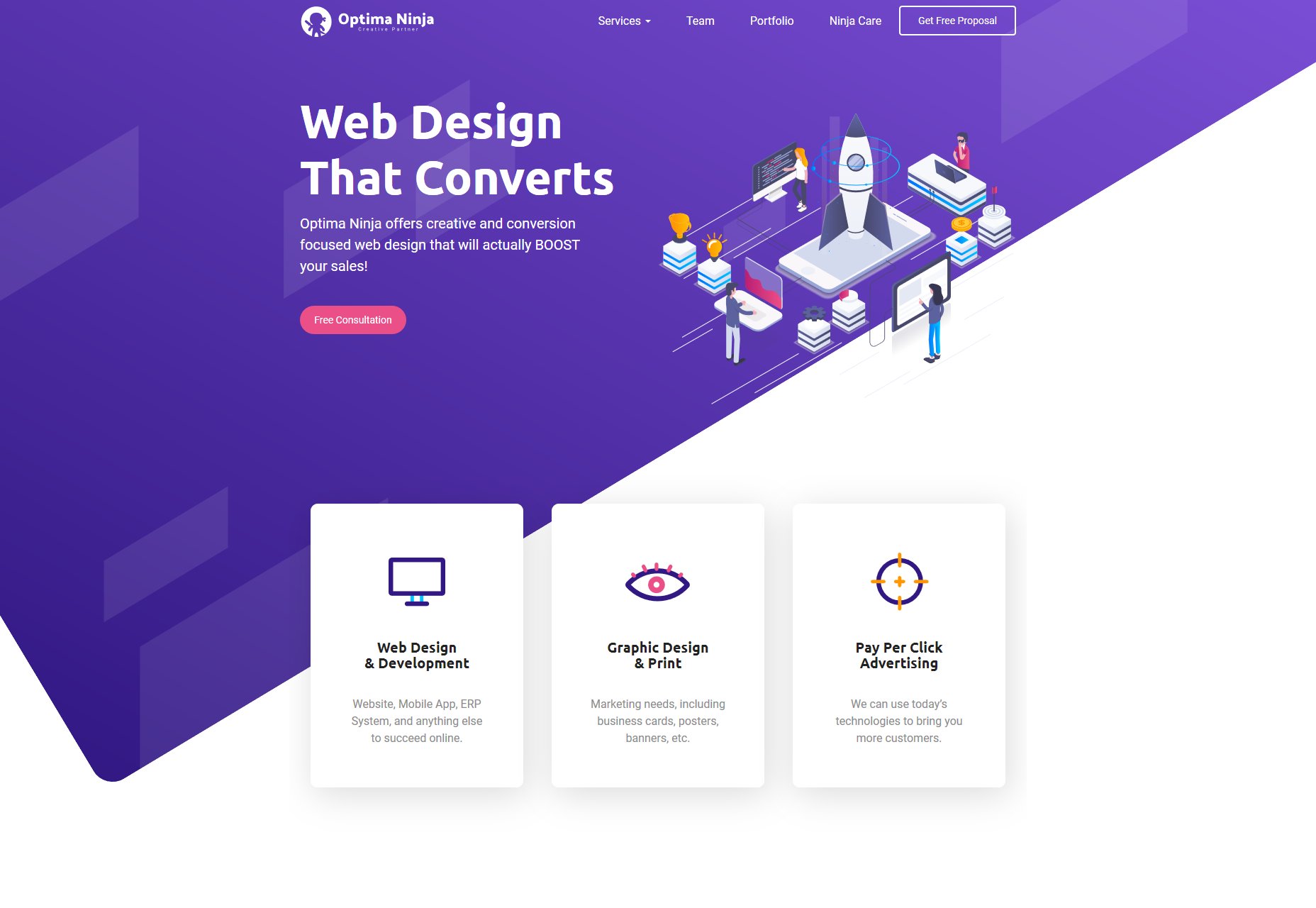
Optima Ninja
Optima Ninja brings us another great design with lots of purple, diagonally-orientated elements (I always like those), and clean sans-serif typography. It’s maybe the single most classically “business-friendly” design on the list this month, and it’s actually kind of a nice break from all of the super artsy stuff.
Platform: Static Site
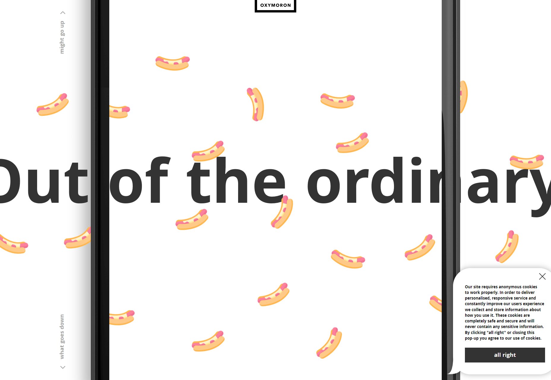
Oxymoron
Oxymoron (love the name) gets wild with illustration, a giant mobile phone “frame”, emoji, spaghetti, and a page that you can scroll down (or up) infinitely because it loops.
They ask if you want to see their “credentials” in PDF format, and clicking “no” will actually get you a message that says “Ok, we totally respect that.” It’s… it’s just… Look guys, I don’t have any reason or the budget to hire you, but can we be friends?
Platform: Static Site
| Add Realistic Chalk and Sketch Lettering Effects with Sketch’it – only $ 5! | |
See more related web design posts here
Recent Comments